I was recruited to 300 employee aerospace startup as first UX Designer to take on accountability for the Design Ops of a FAA certified ground control station that enables one pilot to manage 3 EVTOL aircraft at once.The HMI must be capable of presenting precise aircraft-specific data to obtain FAA certification. The platform functions as a central point for displaying a time-sensitive workflow prompts to users precisely when they require it. The presence of these design constraints necessitates strict adherence throughout the process.
I began my employment at Wisk during the period when the company was privately owned and financed by Larry Page, well-known for his association with Google. During that period, the company operated under the name Kitty Hawk, and I was enlisted to oversee the product design initiative for the FAA-certified Ground Control Station. The project, designated as A2A, was developed to enable a remote operator to oversee the operations of an individual autonomous aircraft.
Cora
The autonomous aircraft, known as "Cora," was equipped with 12 vertical lift fans situated on its wings, along with a large forward propulsion fan positioned behind the fuselage. The aircraft is capable of vertical takeoff similar to a helicopter and seamlessly transitions into winged flight akin to an airplane. Its ability to halt mid-air, hover, and rotate in place is particularly striking when observed firsthand.
The aircraft functions autonomously, requiring no pilot in the cockpit. It is capable of receiving commands and transmitting telemetry data through an encrypted C2 (radio) link.
During my tenure at Kitty Hawk/Wisk I developed and managed roadmaps to define and communicate the product vision and scope of work for the Ground Control Station (GCS) avionics UI.
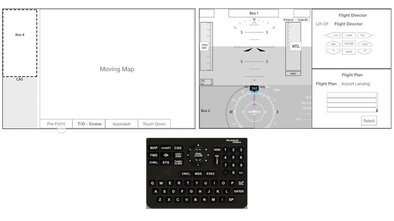
My first avionics program (A2A) at Kitty Hawk/Wisk utilized an off the shelf hardware and software solution. For this program I redefined the information architecture and redesigned the entire Flight Management System to support our use cases.
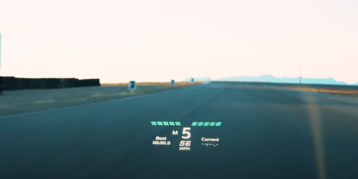
The A2A GCS enabled a pilot on the ground to manage a single EVTOL aircraft.
The A2A GCS program was rather groundbreaking in the world of avionics design. Here we reframed the paradigm of manual flight controls through a remote supervision system.
To meet quality assurance standards the mulitmodal HMI was designed such that every feature within the UI could be accessed by 2 separate input methods.
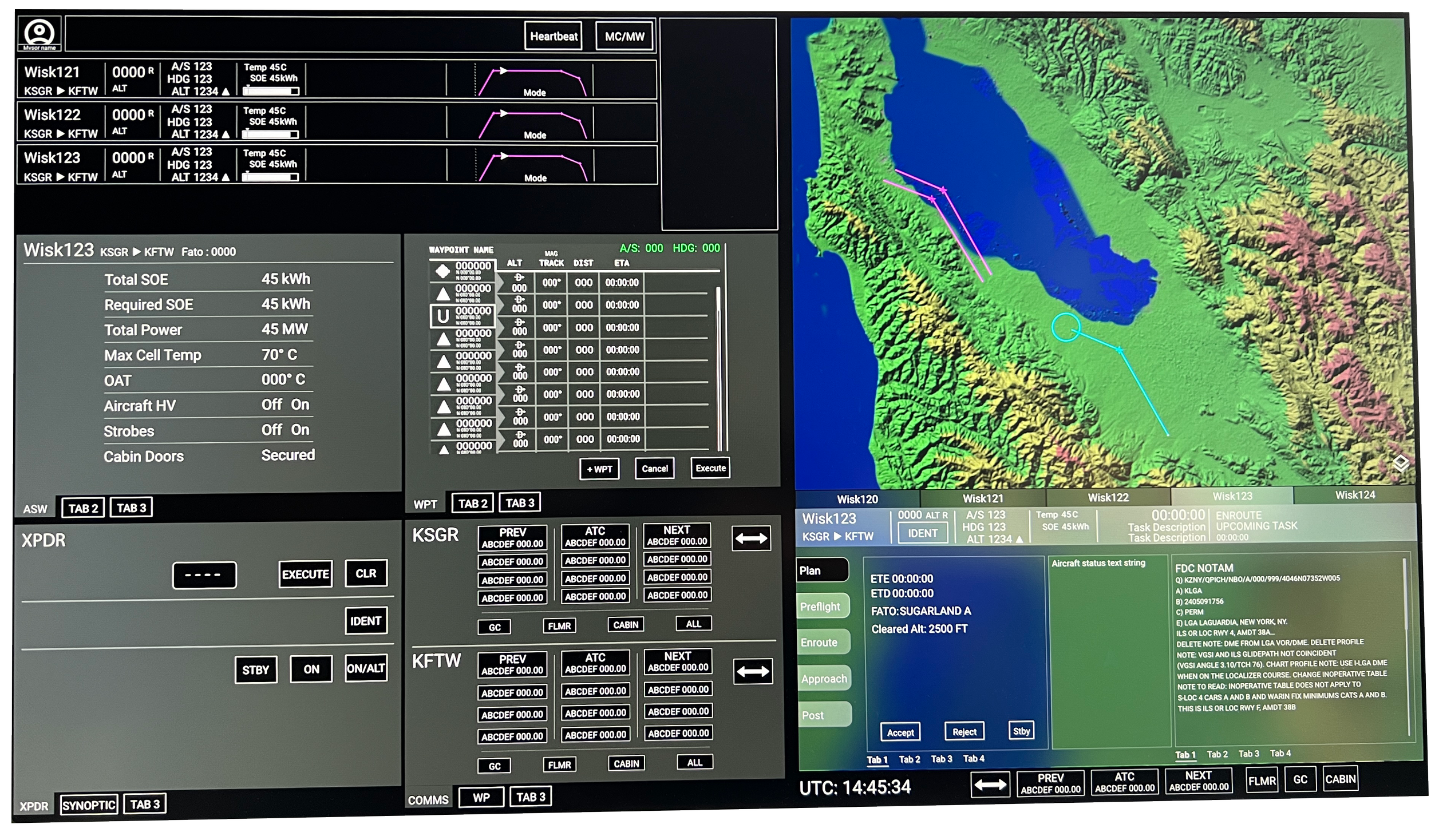
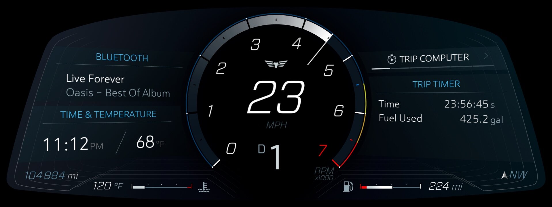
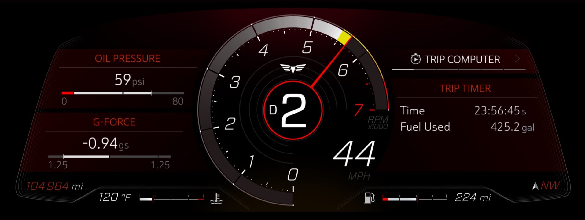
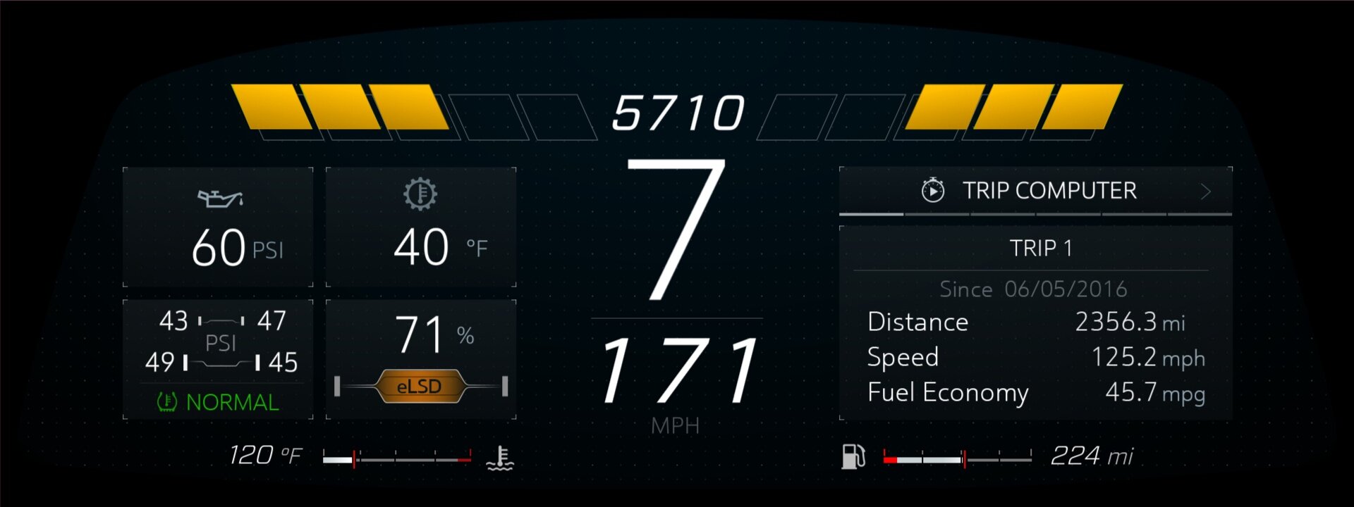
Over the course of several years, the 6th Generation GCS was refined to enable a single pilot on the ground to manage a fleet of 3-5 EVTOL aircraft at once.
This layout illustrates the 25th iteration that the team and I created during the design concepting and iteration phases of the design process. This iteration was reached with the input and alignment of a cross-functional design team that I assembled and led. The team consisted of experts from Human Factors, System Engineering and Software competencies.
I defined the design philosophy of this product as follows: “ The GCS must display the data required for a pilot to make an informed decision as they need it, when they need it.” In order to acomplish this the UI was entirely contextual to phase of flight and the task at hand.
An extraordinarily complex and innovative information architecture was required to support such an innovative UI. Being that the 6th Gen GCS was required to support 3-5 aircraft, the information architecture needed to support data streams for 5 avionics suites at once in order to reach our certification goals.
Throughout my tenure at Kitty Hawk / Wisk I authored and owned the Product Design Roadmaps. I always create my roadmaps by strategically aligning the cross-functional processes, enablers and deliverables of UX, System Engineering, Software Engineering and Hardware teams.
A gant chart doesn’t always tell the story. To create an inclusive culture of cross-functional transparency I documented each stage of the design process within my roadmaps. Giving an overview of Enablers, Work Packages and Deliverables aligned the programmatic expectations across all stakeholders and leadership.
At Kitty Hawk/Wisk I found that leading a cross-functional design effort is the best way to accellerate the design process and gain immediate alignment amongst the stakeholders. The images below represent different exercises and tasks that the team performed during the workshops and design jams that I led.
Card sorting is a great exercise that enables the team to quickly develop a high-level understanding of a frontend layout and architecture.
Brainstorming an order of operations cross-functionally enables each team member to look at the design concepting processes through a lense that is centric to their area of expertise. This contributes to a far greater understanding of the product (solution) as a whole.
Engaging with the end users early through quick-turn iterative prototyping invites a fail fast/ fail early approach which quickly helps to establish a baseline concept. In this photo we are aligning an extremely early prototype with a task analysis study to ensure that we are fullfilling time-on-task requirements.
As the UI design progresses, hi-fidelity look-a-like prototypes are utilized with target hardware.
It is incredibly important to deep dive into testing use cases early on to ensure that the hardware concepts are feasible and successfully user-centric. Here I teamed up with the System Engineering and Software teams to ensue that the Hardware concepts were supported by the backend and frontend architectures. And that the integration would be feasible.
One requirement for the Ground Control Station was that it be designed to be easily broken down and reassembled to support our team in New Zealand. Therefore, I enlisted the help of a mechanical engineering intern to ensure that the structural integrity of display frames would withstand the stress of the heavy displays during shipping. I also designed the configuration of the workstation itself with the pilots. In the right-hand image, I placed graph paper on a table and asked each pilot to set up the desk to their liking. I then charted the position of each element. I came to a set of average positions for each piece of hardware, which was then compared and adjusted to the guidelines defined in "The Measure of Man and Woman" to mitigate potential repetitive stress.
In Sept of 2023 I realized that Human Factors management had very little experience in leading a testing effort which was beginning to block the System Engineering and Software team gates and milestones. To rectify this issue I led a week-long onsite workshop to walk the Human Factors manager through creating a design brief and proper scope of work to support their testing milestones. Upon completion of this workshop the Human Factors managers had a working template to leverage for subsequent user evaluations.
I always embrace the opportunity to dust off my Industrial Design chops and have a go at a concept sketch. Prior to the unveiling of the Gen 6 aircraft's design, it began as a computer-aided design (CAD) packaging study. The initial image represented the preliminary fuselage concept, which the design director modeled in NX (Before). To aid him in determining the proportions and stance of the fuselage, I produced a Photoshop overlay rendering (After).
I joined the 150 employee Chinese automotive startup to manage the Advanced Driver-Assisted Systems (ADAS) features for the Mbyte production electric vehicle. In this role I collaborated closely with the Solutions Architects and internal ADAS engineering teams to effectively translate feasibility, functional requirements, homologation requirements, and ISO standards into actionable design directives.
I also led a team of 5 junior and mid-level UX designers who were tasked with creating the wireframes for each feature set.
Unfortunately the M-Byte never became a reality as Byton abruptly filed for insolvency 2020.
During my tenure at Byton I managed the ADAS roadmap and product specifications for 23 feature sets in order to define and communicate the product vision and scope of work cross-functionally.
These systems included Adaptive Cruise Control, Lane Departure Warning, Auto Parking, Blind Spot Detection, Auto Braking, Brake Assist, and 360 Camera as well as aural and graphical alerting.
In this role I worked closely with the Electrical Engineering, SW Engineering and ADAS Engineers to coordinate integration efforts and define release targets. Through a series of workshops we created a cross-functional schedule / SW Gameplan.
I collaborated with SW Engineering and Solutions Architects to create a timeline of software drops to our Supplier Bosch. This tracking document became the single source of truth for the cross-functional team and leadership.
Each ADAS feature had its own section which included a Overview page where I documented feature Behaviors, Assumptions,Issues (yellow/red) and Potential Blockers. These pages were updated iteratively and any new developments/issues were communicated in a weekly cross-functional alignment meeting that I led.
Each section included separate pages for Overview, Logical Flow and Wireframes.
I collaborated with the systems solution architect to develop a series of sequence diagrams for each ADAS feature. These diagrams were also enabled me to coordinate cross-functional efforts with the Human Factors, Hardware, Wiring harness and Functional Safety Engineers to ensure that we were meeting all ASIL level requirements.
Each feature section included an iterative wireframe with annotations which communicate feature behaviors and user order of operations. Starting out with a high-level set of wireframes enabled me to work closely engineering leads to gauge feasibility mitigate potential integration issues down the line.
I worked with our in-house EE and Function Safety teams to create signal flows/maps for user inputs and vehicle outputs across 5 interior screens connecting the hard and soft switches to the vehicle functions they actuate. The package encompasses ten hard switches for the steering wheel assembly, comprising functions for infotainment, voice control, and intelligent adaptive cruise control, along with controls for PRNDL, defrost, and steering wheel stalks.
Upon joining Byton, I quickly identified that the ambiguity in the design was blocking the UX team. In response, the User Interface (UI) manager and I organized a series of design thinking workshops to pinpoint potential opportunities and establish a hierarchy based on usage and safety considerations. During these workshops, we delved into the breakdown of vehicle behaviors arising from various sources, including the vehicle itself, the driver, the passengers, and other factors.
We engaged the creativity of the UX, UI and representatives from our Engineering stakeholders during the Design Thinking workshops, by having them rapidly iterate fast hand-sketched wireframe concepts to pinpoint pivotal moments in the product's use and map out every single touchpoint along the user journey.
In anticipation of an upcoming formal user testing round, I engaged the services of a mechanical engineering intern to plan and fabricate a modular seating buck. This structure was designed to be disassembled for convenient transport between our company's offices in Santa Clara, Munich, and Nanjing.
The seating buck was designed to adhere to the exact specifications of the vehicle's interior, ensuring ergonomic correctness.
I also had the privilege of being part of a 7-person team that administered user tests in Nanjing, China for 12 days. This marked a significant milestone as I conducted user tests with the use of interpreters for the very first time in my career!
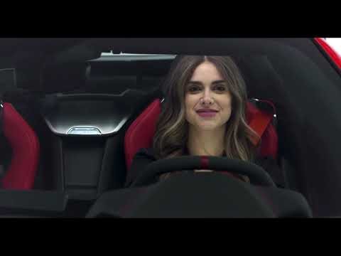
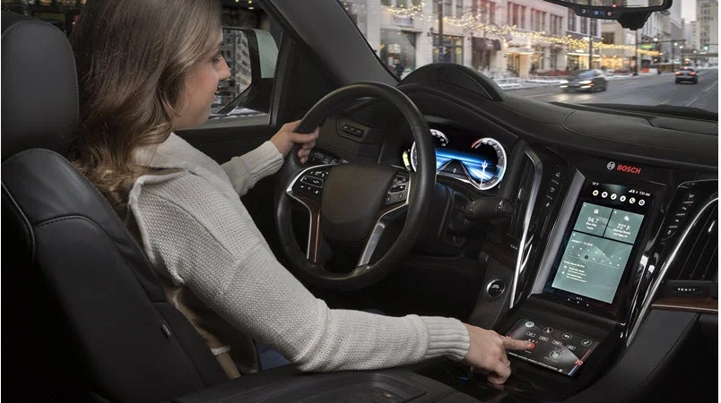
In my role as the UX North American Team Lead at the Bosch Car Multimedia business unit, I assumed multiple responsibilities and performed diverse functions.
I acted as the main point of contact and representative of Bosch for the Corvette Design team. Additionally, I held the role of digital product owner for the Heads Up Display for the 2020 model year Corvette.
I served as the champion for user experience within the business unit, analyzing potential programs to identify UX/UI business opportunities. My responsibilities included creating design briefs and statements of work for our UI design partners, as well as presenting RFQ (Request for Quotation) packages to our potential OEM (Original Equipment Manufacturer) customers.
In addition, I was responsible for managing usability testing for the different programs within the business unit.
In my role as the product owner for the Corvette HUD (Heads Up Display), I was responsible for developing wireframe layouts, screen flows, and assets in accordance with the General Motors Form and Behavior Specification documents. This process involved ensuring the accurate capture of content, behaviors and data values for each feature set.
For the HUD, I aligned with the Corvette engineering product owners to develop wireframe concepts and production assets for the HUD, encompassing various drive modes, infotainment, navigation, ASR voice, phone, and alerting features.
For the instrument cluster I collaborated with our in-house implementation team to oversee the management and expansion of the asset library for the instrument cluster. This involved the creation of integration templates, managing style guides, graphical samples, and asset updates for the upcoming model year.
During my tenure at Bosch I was in charge of all user testing for the Car Multimedia business unit. Here, I conducted and oversaw two stages of user testing in Novi, Michigan, Las Vegas, Nevada, and Stuttgart, Germany as part of the usability initiative. The initial stage involved conducting an A/B HTML wireframe user test on desktop devices. During the second phase of testing, the updated visual brand language was evaluated in conjunction with production graphics, target hardware (screen), and a surrogate steering wheel. The primary objective was to assess user acceptance and compare the updated visual brand language with that of high-end supercars.
As product owner of the Heads Up Display I designed the wireframes and production assets while ensuring a strict adherence to the Form and Behavior specifications required by GM. There were approximately 5 specifications to manage, each of which had 200 + pages. The Heads up display offered a high level of customization and can present detailed turn-by-turn navigation instructions accompanied by lane guidance, as well as hands-free ASR voice control and music/infotainment HMI.
Both the Instrument Cluster and HUD offer several distinct drive modes, each presenting a unique visual design and set of default features. While these settings are customizable by the user, our team has structured the default configurations of each drive mode to align with the most frequently utilized feature sets for contextual support. During integration efforts I created asset/container maps, managed asset deliveries and provided implementation verifications to the SW team and Corvette design studio.
This video gives a nice 3 minute overview of the instrument cluster and HUD HMI .
For the 2018 CES Showcar, I supervised both the industrial design and user experience design aspects of the Bosch show car.
The design sketches and user interfaces (UIs) served as the framework for the Bosch IOT (Internet of Things) mobility vehicle. The vehicle was equipped with Bosch's Controller Area Network (CAN) unit, which provided simultaneous compatibility with both Apple CarPlay and Android Auto. Additionally, it offered simultaneous support for both QT and Linux operating systems.
These graphical user interfaces were derived from a single continuous image featuring a seamless blue-to-red gradient.
For the 2018 CES Show, Bosch Car Multimedia NA planned to retrofit the latest Bosch hardware and software offerings into a stock Cadillac Escalade.
This image above depicts the standard vehicle model.
The image below depicts my conceptual sketch/rendering, representing the final vision for the CES Showcar. Bosch Car Multimedia NA aimed to present an innovative Centerstack display, featuring an extended screen with the Neosense haptic display integrated into the center console. Additionally, an extra 15” screen was proposed to be installed in front of the 1st row passenger seat.
The center stack display in the Cadillac Escalade was notably intriguing as it consisted of a 12.3-inch Digital Instrument Cluster that had been rotated 90 degrees to fit into the vehicle, resulting in a unique configuration.
The marketing team desired a vision that is both atmospheric and abstract. I created a concept which envisioned flowing ribbons to exhibit a kinetic quality which moved slowly behind the interface iconography.
The depicted image represents an early version of the secondary Integrated Center Stack Screen. It was designed for use with the Bosch NeoSense haptic control screen, which allows users to perceive the edges of each button through a system of vibrating motors.
A nice overview of the Internet of Things concept at CES.
Also check out the write up in Autoblog!
https://www.autoblog.com/2018/01/30/bosch-digital-cockpit-infotainment/
As a member of the DiVinci Group at FCA, I served as an Industrial Designer specializing in the technical design of the Chrysler Pacifica vehicle. This process started with taking sketches from the interior studio and creating photorealistic sketches of technical exploded views illustrating A and B surfaces in photoshop. This drove consensus between design and engineering teams and outlined content for trim levels.
Towards the conclusion of the program, I was situated in the FCA VR Studio, where I specialized in producing high-resolution 3D VR renderings of vehicle interiors. My focus encompassed price class color trim, content, as well as A-Surface part-to-part interface and tolerances.
Awards:
Ward’s 10 best Interiors List for 2014
In collaboration with a dimensional engineer specializing in the Instrument Panel, I drafted a comprehensive exploded view that portrays all trim levels of the Plan of Record (POR). We utilized the exploded views to achieve consensus on various aspects including costing, part-to-part interface, and formulating a build sequence for the manufacturing line.
Exploded views were meticulously generated for all interior components of the vehicle, mirroring the detailed approach employed for the instrument panel. Seats, side panels, head liners and in this case, the Center Console. In the development of the Pacifica, various trim levels were available for customer configuration, each necessitating its own set of exploded views. During the initial phase, existing data from the Town and Country was leveraged alongside Photoshop sketching and renderings to facilitate the development of the Bill of Materials (BOM) and costing.
Much like the Chrysler Pacifica, I was the 2D Technical Creative (Industrial Designer) in the Interior Craftsmanship Studio. This particular program carried-over the platform and the majority of components from the US version of the Jeep Cherokee. However, in the Chinese market, the second row passenger seats are the most important position in the vehicle. Therefore, we extended the leg room for 2nd row passengers and offered more options on seat configurations which included center console upgrades.
Media:
GAC FCA Celebrates First Jeep Cherokee to Roll Off Assembly Line in Changsha, China
As an Industrial Designer in the Interior Craftsmanship Studio (DaVinci Group) I was a contributing designer on the Model Year 2014 Chrysler 200 program. Here I authored a set of visual validation studies which depicted:
- “End of Panel” tolerances. This showed the variances between the interfaces of the A-Pillar, instrument panel, top cover, and Door.
- Console door Z & Y Axis gap studies
For this type of validation study, I generally delivered results in a 2D format and followed up with a “real time” study in the VR Studio for all stakeholders.
Awards:
The initial validation study was run in an immersive 3D environment where potential tolerance movement was captured from the driver eye ellipse. Here we studied approximately 5 - 8 different Ramsis dummies. The second round of validation was done in an H-Pointed CNC routed seating buck.
The "Restar" project began as an investigational business proposal based upon the negative pressure wound therapy (NPWT) market. In traditional NPWT, a sponge is inserted inside a wound, post debridement, covered with a vented film, and subjected to a low pressure vacuum. This treatment forces granular tissue to the surface of the wound, promoting healing. This process is generally used in diabetic and decubitus ulcers.
The Restar paradigm utilized a single-use adhesive structural dome in which saline would be used to equalize pressure across the face of the wound. This would theoretically enable, vascular and cellular waste to be evacuated from the NPWT environment. It would also enable cleansing solution to be pumped across the face of the wound allowing for longer term treatment.
All rights reserved.
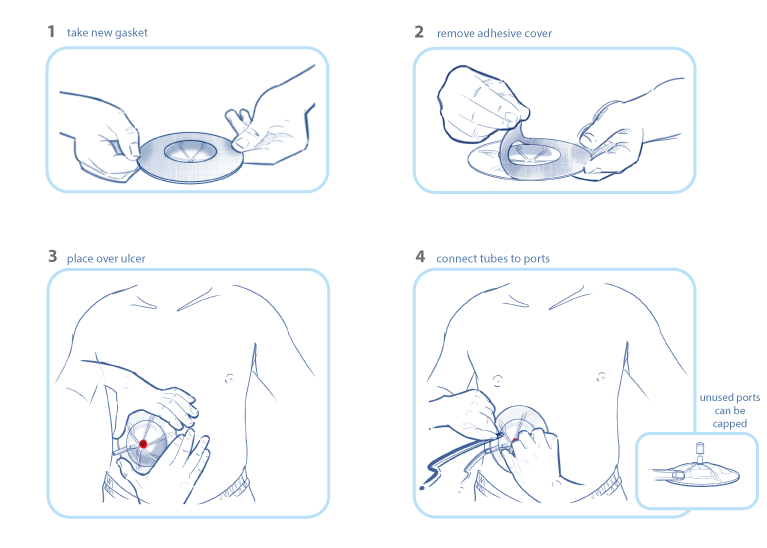
Restar is a single use Negative Pressure Wound Therapy (NPWT) gasket.
Preparing a wound for NPWT is a multi-step process that must be completed with a high level of accuracy. If any of the steps involved are not executed correctly, the wound must be re-dressed causing providers to incur excess costs in time and supply loss, not to mention patient comfort.
As I embarked upon this project, I conducted in-depth research studies to build a solid design and business case. Market indications and predictions were used to find current and emerging markets. As well, I researched and documented the financial impact of wound therapy on patients, care givers, insurance agencies and hospitals. Finally, competitive benchmarks were drawn to uncover the breadth of competitive companies, their niche within the market and their pricing schedules.
The Restar is designed to have a clear vacuum reservoir which allows care providers to view the progress of treatment in real time. With current NPWT methodologies, care providers must remove the dressing in order to view the wound. This results in higher health care costs incurred from supplies and man hours.
The Restar has a clear all-in-one design with a self-adhesive base. This cuts down on care time and mistakes. The dual port design allows care providers to utilize either port for incoming and outgoing pressure based upon the location of the wound in relation to the vacuum pump.
Preparing the patient for NPWT treatment with Restar is surprisingly fast and easy. The provider simply peels back the protective sheet exposing the adhesive base. Positions Restar over the wound and then connects incoming and outgoing ports to the vacuum device.
Fluid enters Restar from the incoming port and fills the reservoir with saline solution until completely full and flowing through the outgoing port. At this point, the incoming port is shut off and vacuum pressure is applied through the outgoing port. The saline solution replaces the job of the sponge in traditional treatments, equalizing negative pressure across the face of the wound, drawing granular tissue out to the surface of the wound.
One issue with traditional treatments is that the sponge catches waste materials and holds it against the wound. This minimizes the length and success of the procedure. By using saline solution, the wound is constantly flushed of waste material. As well, the dual port design allows care providers to push cleansing fluid through Restar, disinfecting the wound environment.
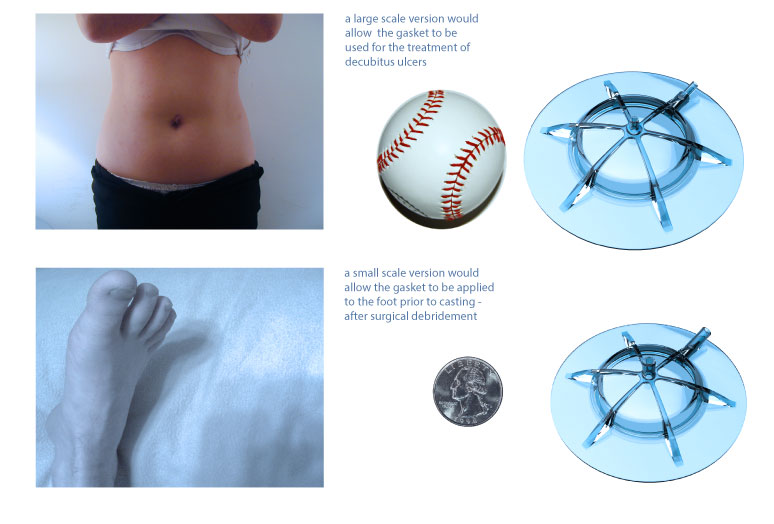
In order to reach the target of a 2% market presence, several sizes would need to be machined and manufactured. A large version for decubitus ulcers (bed sores) and a smaller more flexible version would be needed to serve the market of diabetic foot patients. Because Restar can be cleansed several times during treatment, it became a promissing option for the treatment of diabetic foot since some treatments indicate the application of a full foot cast in order immobilize the foot and wound tissue.
The Anchor Leg Splint is a low-cost solution for immobilizing foot and ankle injuries. Initially designed to serve the low-income populations, it can be flat-packed for easy shipping and storage. As well, it is capable of being placed over footwear in emergency situations. Making it a great candidate for humanitarian and military applications.
To create a low-cost leg splint that can be utilized in a variety of applications, from Doctors Without Borders to domestic low-income populations.
I completed a set of medical illustrations to better understand the underlying structures of the lower legs. The natural levers and fulcrums of the human mechanism was of utmost importance as I experimented with immobilizing ones foot comfortably.
The initial direction utilized a disposable rip chord mechanism that, when torqued to a specified level of pressure would lock into place. This direction was abandoned as the ratcheting mechanism would have been to costly to produce.
Instead, I began to investigate the ability of the Anchor to create a structure by overlapping the straps atop of one and other.
In this phase of the project I utilized foam core and sheet plastic to test methods of applying tension to the splint without placing any pressure on the foot or ankle. During these experiments I came to understand how using cross tensioning might create structure to a highly malleable medium.
The final design of the leg splint utilized medical grade low density polyethylene for the main components. This is the same material used in manufacturing shampoo bottles. This also makes it possible to manufacture the splint from materials containing a percentage of post-consumer waste. The large handles and finger loops make it easier for application in a variety of environments and climates.
The Anchor Leg Splint is constructed of three pieces of sheet plastic. Because the design is planar, die cutting in the Z axis creates a low cost manufacturing scenario.
The final prototype was created with CNC milled low density polyethylene and construction grade velcro. As depicted in this step-by-step photographs series, the Anchor can be applied over clothing and footwear.
Because of the low cost manufacturing technologies and ease of use, the Anchor is a great solution for low-income, military, and emergency scenarios.